
Colour and Contrast
By Carolyn Gibbs
Choosing fabrics for a quilt is something that many people would like to do, but lack confidence for. They are not sure why the colours that looked good in the shop don’t seem to give the result they hoped for.
When you’re choosing fabrics for a quilt, I would encourage you to make your own choices, and not just to do the same as someone else. Colour is very individual; the same design done in alternative colour schemes can look very different and express our personality.
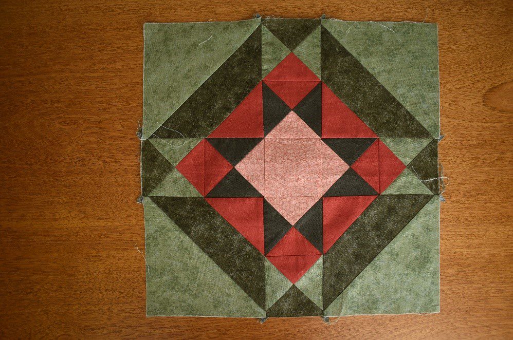
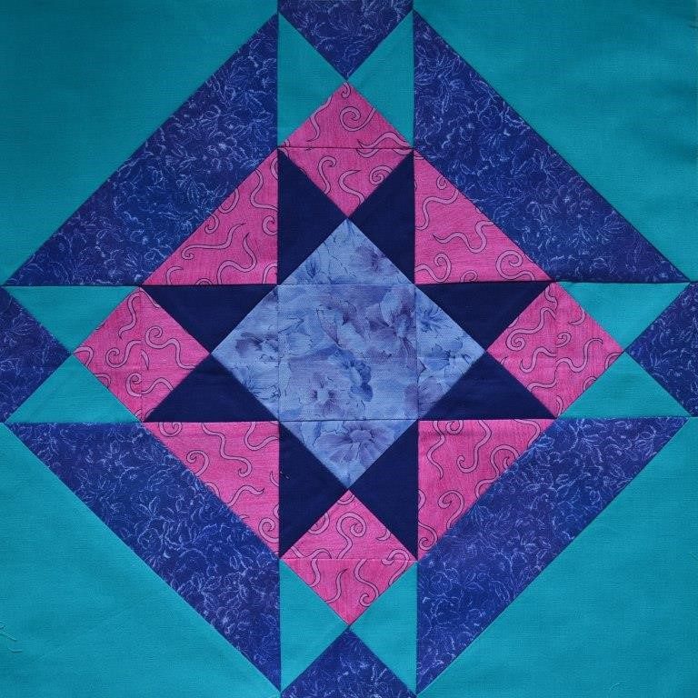
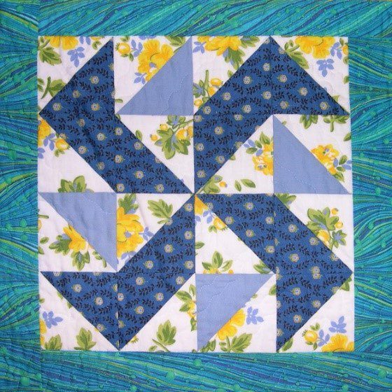
Look at these two Solitaire blocks done in different colourways. Which of these do you prefer? Don’t worry if you like both, (or even neither!) – a combination that one person loves may not be to the taste of another. I hope you can still recognise that a colour choice works, even if it’s not what you would want in your own home.
Value
Successful quilts are those which show the design clearly. These will involve enough contrast of the design shapes (such as a star) against the background. This can be a dark design against a light background; or a light feature on a darker background.
So, I am going to concentrate on identifying the value of a fabric (how dark or light it is). This is actually more important than the colour, and is the key to effective choices for traditional style patchwork. All of this guidance is available as a free download; the link is also at the end.
Selecting fabric
Work out how many different values are needed for your chosen design, and then select fabrics to fit these values.
So, for a two colour design, you could choose:
- Dark / Light
- or Dark / Medium
- or Medium / Light
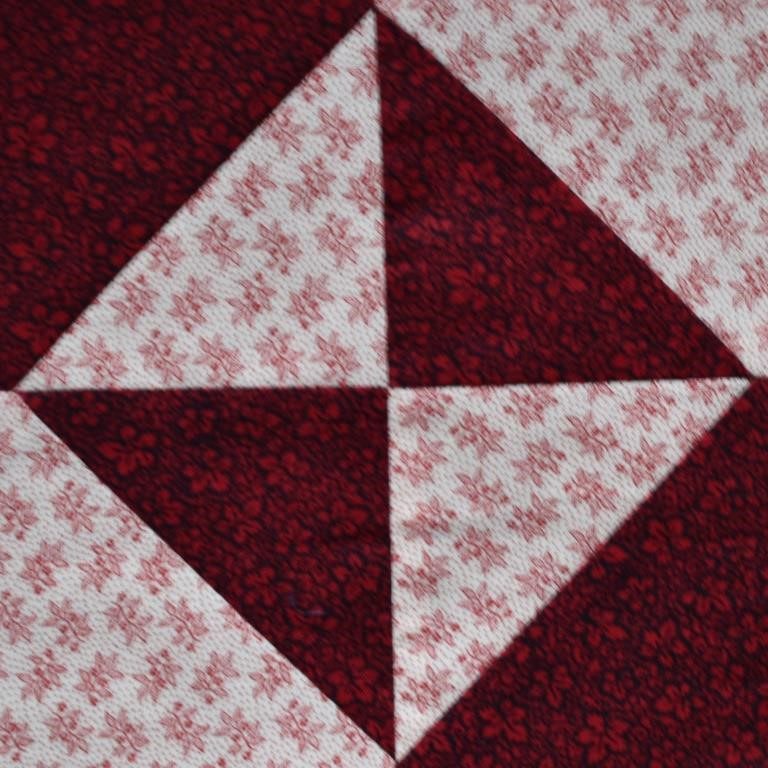
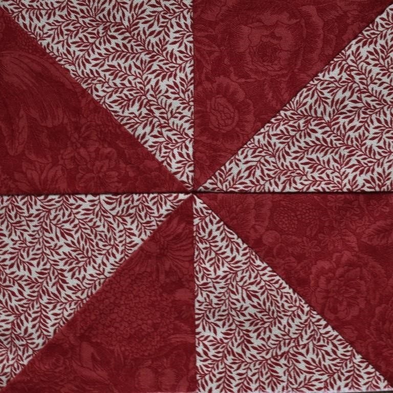
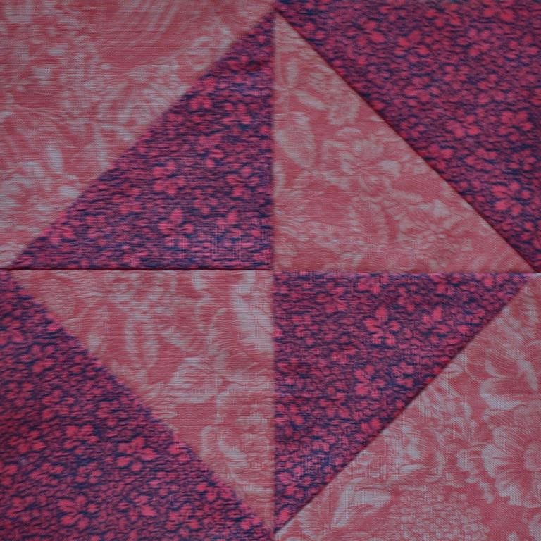
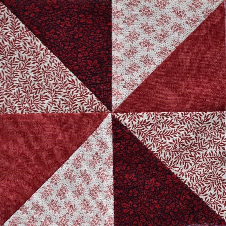
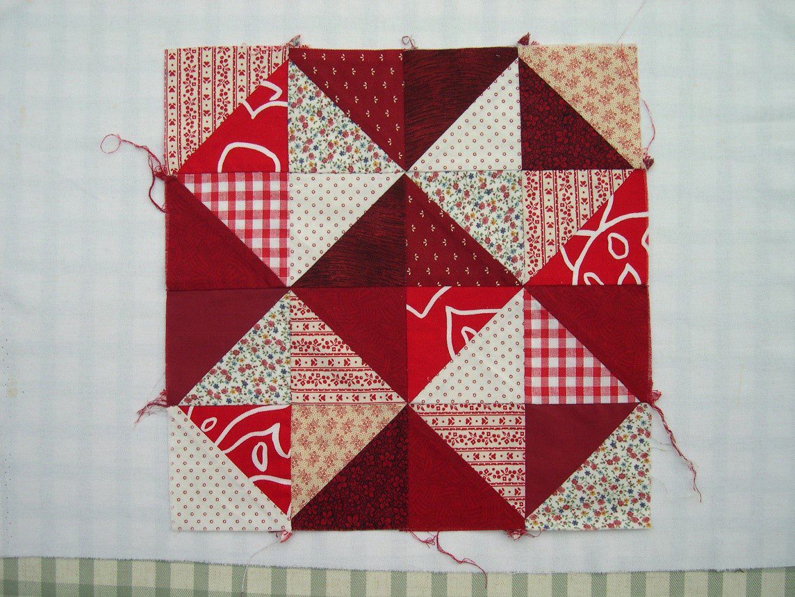
As long as there is sufficient contrast between those for the different parts of the design, then it will work – no matter what the colours! Both of these samples just use red patterned fabrics – but there is enough contrast. Example below.
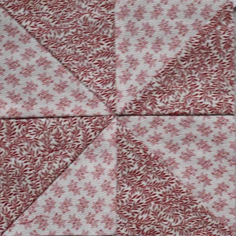
Colours that are too similar in value will simply not show the design. Example below.
When you look at fabrics, try to decide whether each fabric is Light, Medium or Dark. If that is easy, split the categories down a bit further and include Very Dark; Medium Dark etc.
If you struggle with this, try using a “ruby beholder” – a piece of red glass or plastic to look through.
Photocopying the fabric can help too, by removing the impact of the colour, and allowing you to concentrate simply on value.
However, particularly in more complex designs, you need more than two fabrics – and wherever they meet, they need to contrast enough to show up.
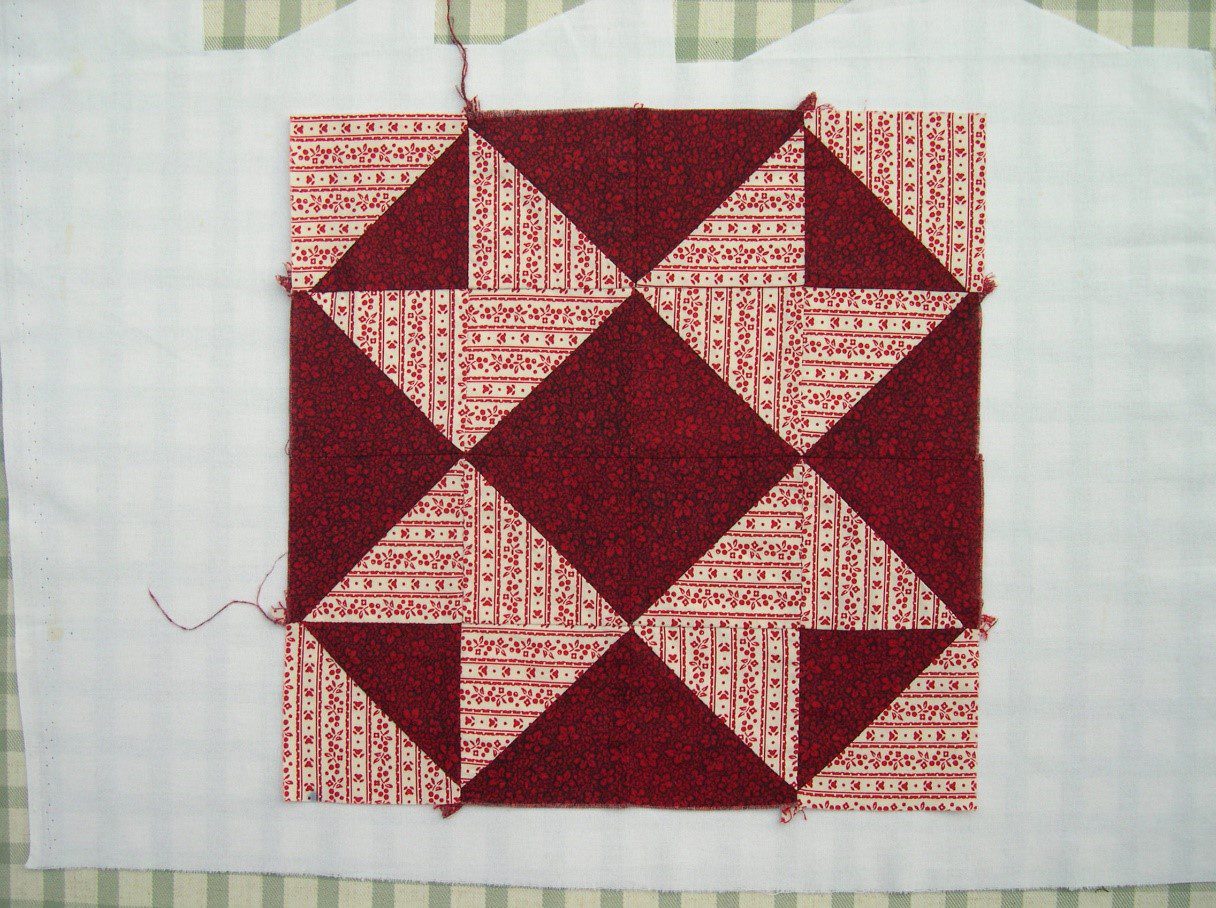
Three colour:
- Dark / Medium / Light
- or Dark / Medium Dark / Medium
- or Medium / Medium Light / Light
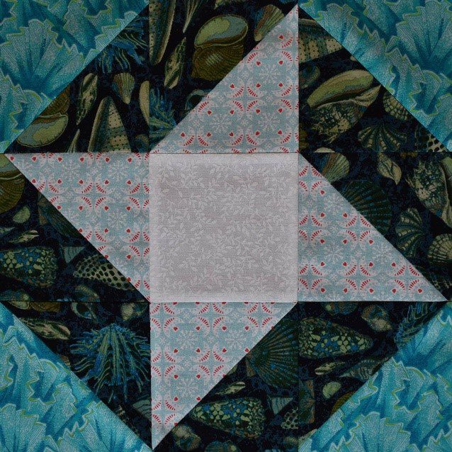
The three fabrics in this Yankee Puzzle block all contrast against each other. It is from my Provencal Sampler pattern, which has fifteen blocks of increasing difficulty. All use just three fabrics, so this would be a good project to practice on. The download pattern, which has 21 pages of detailed instructions, is available in my online shop for £8.
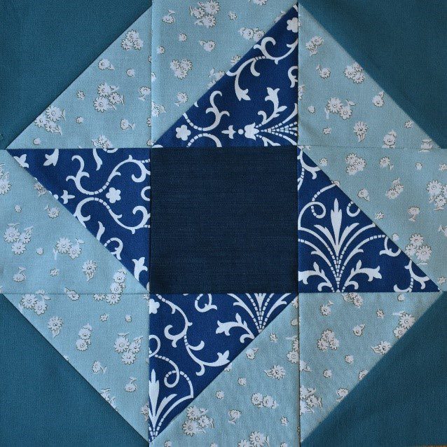
A block which use four fabric values is the Friendship Star shown later – I have a skill-builder pattern for a quillow in this design too.
So, how do you check whether fabrics will work together, once you have identified the value of each (remember, that’s the degree of darkness or lightness)?
Lay the proposed fabrics against one another. Step back and screw your eyes up a little (or take your usual glasses off!).
Can you clearly see the difference between them? If so, then go ahead and use them!
Pitfalls
Be aware that the fabrics that are instantly most attractive in the shop are often those which have a definite pattern in several colours and are neither particularly dark nor particularly light. This is so that they look good on their own.
Don’t make the mistake of just choosing these Medium, busy fabrics though – several of this type of fabric together just makes a confusing mess and doesn’t show up your patchwork design clearly.
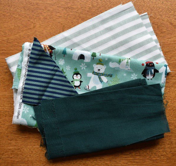
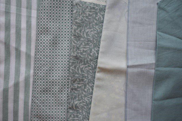
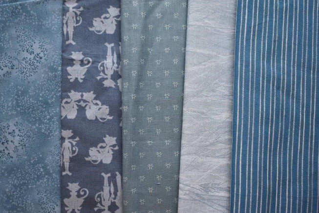
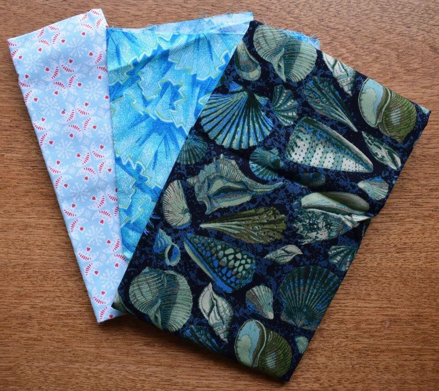
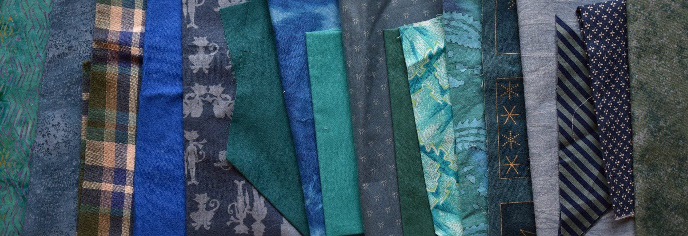
For example, I had these four fabrics all in gentle tones of soft green-blue.
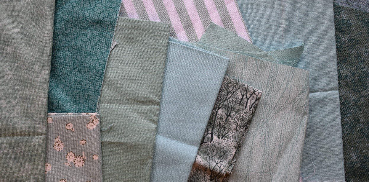
The second is more modern and vibrant – it’s a bit busy for me, but some of you may prefer it.
Both of these have a big difference between the darkest and lightest fabrics – but if you like a lighter look overall, this can be achieved with fabric choices which still have enough difference between Light and Dark, but where the value contrast is less extreme.
This third Friendship Star is light and fresh, but even the flowery fabric still shows clearly against the very pale mint green, as does the feature star.
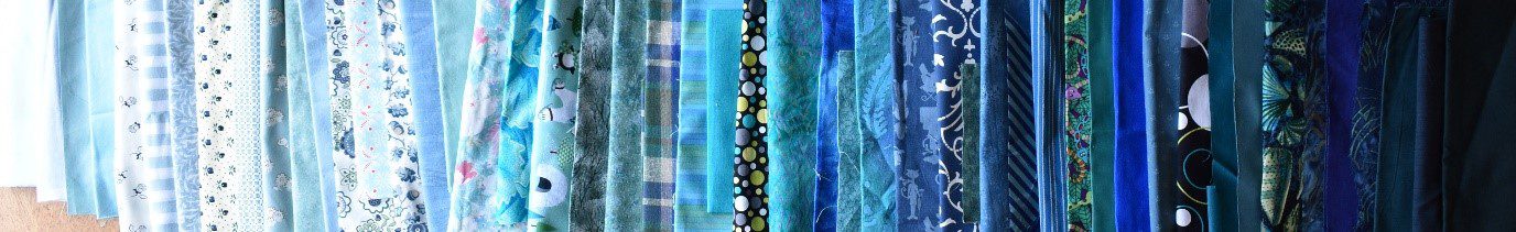
Try to develop an observant eye when looking at fabric, making a note of the style that you are looking for, as this will stop you wasting money when shopping! Personally, I hardly ever buy pre-packaged ranges such as Fat Quarter bundles or charm packs, as they usually contain too many Medium values, and don’t include the sort of contrasting fabrics that I want.
Very dark fabrics are easily overlooked.
Try to get in the habit of buying much darker and much lighter fabrics as well as the attractive Medium values – they may not look as exciting on the bolt but will show up your feature fabrics to better advantage.
However, your local quilt shop may not have many of these on the shelves. They only stock what people usually buy, so ask them to widen their range if you don’t see what you want. Don’t forget the neutrals – beige, cream, grey, taupe. These have recently been popularised by “Modern” quilters as they can make a more sympathetic background than white.
Practice describing colours according to several headings – can you find fabrics in my picture which fit with the following descriptions?
Describing Colours
Try to describe colours according to several headings:
Colour
Don’t limit yourself to “blue-green”.
What sort of blue/green?
Sea green, powder blue, bottle green, navy blue, turquoise, aqua, eau de nil, petrol blue, jade, peacock, grey-green, sky blue.
Design
Stripe, check, floral, geometric, flowing, angular, pictorial.
Scale
Large print, small print, plain, mushy blend.
Internal contrast
Tone-on tone, busy, multicoloured.
Mood
Bright, loud, muted, pastel, clear, muddy, soft, sombre, rich, faded.
Value
Bright, loud, muted, pastel, clear, muddy, soft, sombre, rich, faded.
Try laying out your fabrics sorted from the lightest through to the darkest. It can be quite revealing – particularly for those highly patterned fabrics!
For a particular patchwork block, work out how many different values are needed for your chosen design, and then select fabrics to fit these values.
Then try others.
Keep trying until you find the ones that work best – a good quilt shop should allow you the time to experiment and think before you buy, even if it does mean twenty bolts of fabric spread out across their table.
Remember that a fabric that behaves as a “Dark” in one colour scheme could be a “Light” in another against much darker fabrics.
Or, you can reverse the colour scheme given on a pattern, so that the Light becomes Dark and vice versa.
Some “counterchange” designs incorporate both these at once.
The key is contrast. Different value is the most important thing, but complementary colours will also contrast, and a plain fabric is a good choice to show up against a busy pattern.
All of the downloadable patterns that I sell on my website have the fabric requirements listed in terms of Value (e.g. Very Dark, Medium Dark, Medium Light & Light), rather than colour. This enables you to select fabrics to your own taste that will produce a unique and successful result.
Why not have a look at these patterns in the online shop?
Scrap Quilts
The greatest need for an awareness of value and contrast is in scrap quilts. Here, instead of just one fabric having a certain value, several, or many different fabrics are selected which have the same value.
So, for a two-value design, instead of just one Dark and one Light fabric (as on the Mosaic block shown on the left above), you need many different Dark and many different Light fabrics – as in the same design on the right above.
The right-hand block above shows colour choice right at the limits of successful value – it is just possible to distinguish the star design, but only just. This is where you need to avoid Medium value fabrics – or they won’t show up well enough!
You need to sort out your fabrics and collect together those which are sufficiently similar in value to “do the same job”. For example, these are all “not-too-busy, Medium fabrics”.
Then collect together a pile of fabrics which “do a different job”, such as these “Light, calm fabrics” below. I could combine both of these sets of fabrics into a “two value” scrap quilt – although I think I would need to take out the fabric at the right-hand end, and possibly the one second in from the left, as the value is too similar to the darker fabrics above. Look at both pictures together – can you see a clear difference?
The classic design which uses a selection of scraps of fabric is Log Cabin. I have placed all the blocks the same way round on my Christmas Card Hanger, but there are many different quilt designs that can be achieved by arranging the blocks in different ways – all of which depend on the difference between the dark and light sides of each block.
The fabric in each block is slightly different, but the overall effect is consistent because dark fabrics are always used on two sides, and Light fabrics on the other two sides. This pattern is available in my online shop.

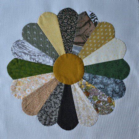
Another scrap classic is Dresden Plate. The image below is a sample that I made a few years ago – but I can see now that one or two of the “petal” fabrics I chose are really too light. They don’t show up well enough against the background.
When I decided to make this Celebration Card Hanger for my parent’s Golden Wedding Anniversary, I had to choose the selection of yellow and gold fabrics very carefully – they all had to be dark enough to show up against the cream background; not an easy task with a fundamentally pale colour like yellow!
On the other side, I wanted to use a selection of white, cream and pale gold fabrics in a reverse colourway, and searched hard for a deep old gold fabric for the background, so that it would have sufficient contrast in value against the partial Dresden Plate “butterflies”.
It took months to collect enough suitable fabrics!

The pattern for this card hanger is also available in my online shop for £8.
When it was complete, of course I had a large selection of yellow, cream and white scraps of fabric left over.
These came in when I was asked to create a quilt for the “In the Spotlight” competition in 2007 at The Festival of Quilts.
The theme was “August”, and after a lot of head scratching, I decided to make “Thunderstorm”.

My design required carefully placing the fabrics by value:
- going from deep yellow through to white up the zig-zag,
- going from deep yellow to white going down the fragmented patterns at the edges.
To achieve such careful grading of colours required laying it all out on a sheet on the living room floor and swapping round the many different small units that I had made until it looked right.
My family got very fed up of walking round it.
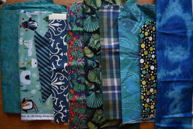
The close-up below shows many of the fifty or so different fabrics which went into this project.
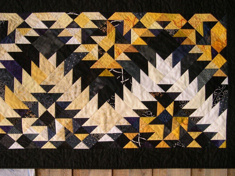
Any patchwork design can be done as a scrap quilt.
This simple Northern Lights block uses two Light and two Dark values.

Shown here is one little scrap quilt which uses this block. Click to see several different scrap quilts which also use this little block.
Rather than a complete mixture, try to decide on a family of colours and a common mood – this will give a more coherent feel to the design.
It took me two years to collect the raspberry pinks and purplish blues for this double bed quilt “Solitaire” – you can see more photos at www.carolyngibbsquilts.co.uk/my-designs/bed-quilts/.

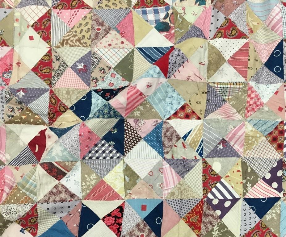
Of course, many scrap quilts don’t use such carefully planned colour placement.
This cheerful scrap quilt was made by Harriet Yeatman in the late nineteenth century. Note that even this apparently random selection does not include every possible colour.
If you like antique quilts, why not look at others in my Collection shown on my website.
Further information
I hope you have appreciated how these tips can help with your colour and value choices. A summary of the information included here is available in a free download for you to keep and refer to. There are more suggestions for improving your patchwork and quilting in the Techniques section of my website.